The WordPress Stack Behind a 5,000-Person Live Event (We’re Sharing Everything)

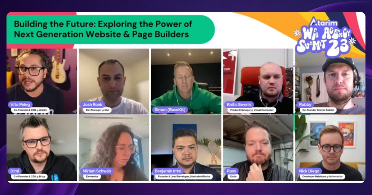
People always ask us two things about Web Agency Summit. First, how does a small team pull such a HUGE virtual event. 

And second, once we tell them what it’s built on, there’s usually a long pause.

“…this whole thing runs on WordPress?”

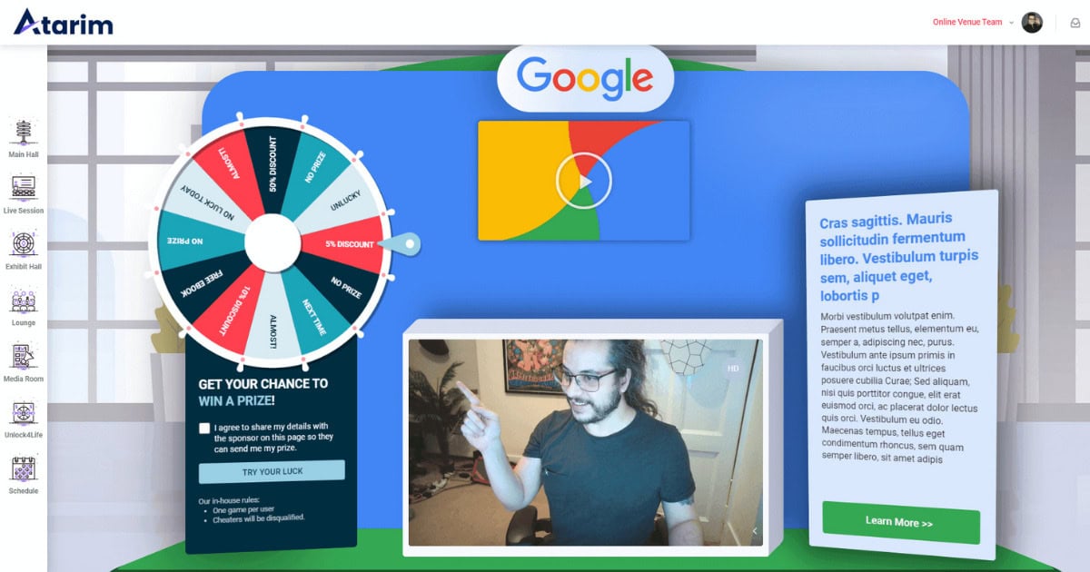
Every video room. Every live chat. Every sponsor booth and session schedule. WordPress. All of it, how cool is that? 

So we figured it was time to pop the hood and show you how the whole thing actually works.

Quick Backstory

If you want the full origin story of how the summit came to be (canceled flights, a crashed platform, a pandemic), we recently wrote a blog on it. The short version: WordCamp Asia got canceled a week before we were supposed to attend, Vito stayed up for a week and a half straight and built the first version of this platform.

Well, not from scratch. And that’s the whole point.

The philosophy from day one was: find plugins that get you 80% of the way there, then customize the last 20%.

The Tech Stack

Here’s what actually powers the platform (no gatekeeping here 😉).

BuddyBoss is a WordPress theme built for online communities and membership sites. 

We use it as the theme, but we’ve stripped out about 95% of it. We only use it for the login system, user profiles, and messaging. Everything else, gone.

Toolset is the real backbone. 

It’s what lets us create all the different content types on the platform (sessions, sponsors, media partners, video rooms, the schedule, speaker panels) and control how they look on the front end.

Dave, our designer, joined us from a background designing for Disney and Hallmark. WordPress was new to him, but he took to Toolset quickly. As he put it: 

“It was trial by fire, had to learn on the fly, but Toolset was one of the best experiences I had. Your JavaScript, CSS, and HTML are all in one spot. You don’t have to jump between Elementor or custom code or anything like that. Everything’s on one screen.”

Gravity Forms handles registration, login flows, and sponsor onboarding. Anytime you’re filling something out on the platform, that’s Gravity Forms.

WP Stream handles the video side.

We broadcast through StreamYard (what the speakers and hosts see), and that feeds into WP Stream (what attendees see inside WordPress). 

Getting here wasn’t easy. Year one, every session was pre-recorded. Year two, we went live but used our own video servers and burned about $10,000 in bandwidth alone. Eventually Gabriel, the founder of WP Stream, became a sponsor and made the whole thing waaaaay more affordable.

Jitsi powers the virtual lounge where attendees can hop in and actually talk to each other face-to-face. Someone told us one year it was the closest thing to actually being at a WordCamp.

WP Discuz runs the live chat, so you can throw questions directly at the speakers in real time. This year we’ve got Eugene Levin from Semrush and Mary Hubbard from WordPress on stage, so maybe start thinking about what you want to ask them now.

3 Million Requests Per Day

We wanted the platform to feel like YouTube Live or Facebook Live, where comments are flying in real-time while you’re watching a session. 

WP Discuz does this by checking for new comments every few seconds.

Sounds fine. Until you think about what happens when thousands of people are all watching sessions at the same time, and every single one of their browsers is asking the server “any new comments?” on a loop, every few seconds. 

That adds up to about 3 million requests hitting the platform per day.

The first year we set this up, it was even worse. Every time someone opened a session, the platform loaded the entire comment history for that session. 

So if people had left 4,000 comments, your browser was trying to load all 4,000 every time the page opened. Our friend Tom Fanelli over at Convesio (who we brought in to handle the summit’s infrastructure) caught it during testing and the fix was simple: show the newest comments first, and only load older ones if someone scrolls back. One change. Night and day difference. Whew!

On top of that, Vito wrote about 10,000 lines of custom styling to make the comment system actually look and feel like a real-time chat instead of a blog comment section. It’s a commenting plugin wearing a very convincing disguise.

The point for anyone running an agency: you can push WordPress plugins way beyond what they were originally designed to do. 

You just need to test things properly so you catch the stuff that breaks when real traffic shows up.

Sponsor Booths

Every sponsor gets their own booth on the platform, and they can customize it themselves. They pick their brand colors, upload their logo, set up their content. No one from our team needs to touch it.

Dave designed the sponsor area in Figma, then brought it into WordPress using a combination of graphics and custom fields. Each sponsor’s brand colors get pulled in automatically, so the whole area feels cohesive but every booth looks different. If a sponsor doesn’t set their colors, their space just defaults to gray so nothing looks broken.

It feels like something that was custom-built for each sponsor. In reality, it’s one reusable template with a few smart customization options.

Load Testing 

When a client’s website goes down for 15 minutes, it’s annoying but survivable. When your live event goes down mid-keynote with thousands of people watching, let’s just say everyone on the team is panicking.

There’s no “we’ll get to it tomorrow.

Before every summit, Tom runs simulations where he throws a huge number of fake users at the platform to see what breaks. 

This is trickier than testing a normal website because every summit attendee is logged in. Normal website tricks like caching (where the server saves a copy of the page so it doesn’t have to rebuild it every time) don’t really work here because every person’s experience is slightly different.

The tool Tom swears by is Robo Swarm (roboswarm.dev). It’s built specifically for testing WordPress sites under heavy load, and you don’t need to be super technical to set it up.

The 80/20 Thing

We didn’t build some custom application from scratch. We took WordPress, grabbed a handful of plugins, stripped out what we didn’t need, customized what we kept, and ended up with something that handles 5,000+ people at once.

Same approach works for client projects too. You don’t need to build everything from zero. Know which tools exist, know which ones are solid, and put your energy into the part that makes the final product feel like it was purpose-built.

That’s been the philosophy since 2020. It works.

Web Agency Summit 6 runs April 27-30. If you want to see this platform in action (and, you know, actually learn stuff that’ll help your agency), grab your ticket, it’s FREE!

HUGE shoutout to WP Stream for sponsoring this year’s summit again. After reading this post you can probably tell how much of the platform runs on their tech. Gabriel and his team have been with us for years now and we genuinely couldn’t do this without them. Thank you, seriously.

And a massive thank you to all our other sponsors making this year’s summit happen. We appreciate every single one of you.

The Atarim Summit Origin Story – Where It All Started

The Web Agency Summit is back for its 6th year. But before we get into what’s coming, we want to take you back to where it all started. 

A canceled flight, a crashed platform, a pandemic, and somehow, the biggest event in our industry came out the other side.

It Started With a Cancellation

In early 2020, we were a small team, just under a year old. 

We had hedged a HUGE bet on WordCamp Asia. Sponsoring the event, tickets for flying our team out, big money on swag, showing up in person for the first time. We were planning on making a splash.

Then COVID hit, and the event was canceled. Bummer.

We found out the way everyone else found out: a notification on your phone, and then the slow realization that the thing you’d been building toward just wasn’t happening.

We totally understand why, everyone’s safety was the number one priority, but I’d be lying if I said we weren’t disappointed.

WordCamp Cancellation

Behind the scenes, we’d already sunk serious time, energy, and money into it. Flights booked. Booth designed. Swag shipped. Talking points rehearsed. We were barely off the ground and could have lost the business entirely. 

Instead of sitting in that frustration, Vito asked a question that would change everything:

What if we still bring people together, even when the thing meant to do that is gone?

That’s where the idea for a virtual summit came from.

What Happened Next Surprised Us

We expected a scrappy little online event to fill a gap. What we got was a community showing up in force (as the community always seems to do).

People started reaching out, making introductions, calling in favors. Some of them we’d never even spoken to before. 

Companies like GoDaddy and WordPress.org stepped in early. Speakers said yes before we even had a proper plan. Partners showed up faster than we could keep up with.

What started as a response to a setback became the first virtual summit in our space.

Here’s a throwback to Vito introducing that very first one:

Taking Our Infrastructure Offline On Day 1

So the concept and the marketing were one thing. Now we had to actually deliver, and that was terrifying.

On the first day of the summit, we took our entire platform offline.

The traffic overwhelmed everything. 

One minute the talks were streaming, the next they were stuttering and cutting in and out. Slack lit up. Phones started ringing. For a couple of hours, we were in full CRISIS mode, pulling in help from some of the industry’s leading experts who dropped what they were doing to get on a call with us.

Summit Statistics

Together, we found a solution that brought the platform back up and kept it stable for the rest of the event.

We were surprised not only by how quickly the problem was solved, but also by the kindness of people willing to drop everything to help.

In the end, everyone got to see every talk they were promised. It was closer than we would ever want to admit, and we are truly grateful for everyone who stepped in that day.

Year 1 Could Safely Be Considered A Success

The first Web Agency Summit was rough around the edges. We ran into problems we hadn’t anticipated. We were making decisions on the fly.

None of that mattered. The thing people cared about was the thing we got right. 

We brought the community together at a time when everyone was stuck at home, and the response made it clear this wasn’t a one-off.

That’s how the annual Web Agency Summit was born.


Six Years Later

Every year since, we’ve pushed it further. Bigger speakers. Sharper sessions. Stronger production. What started as a pandemic pivot has become the biggest event in our industry, and this year is the most ambitious edition we’ve ever put together.

But it’s not bigger just for the sake of it. It’s bigger because the problems agencies face right now demand it.

Why This Year Hits Different

Running an agency in 2026 is a different game than it was even a year ago. Client expectations are shifting. AI is reshaping how work gets done. SEO is evolving fast. What worked last year already feels outdated. Everything is just moving so fast and we understand that.

So we brought in people who are seeing these changes happen in real time.

Eugene Levin, President of Semrush. Eugene scaled Semrush into a global platform used by millions and led it through a major acquisition. He’ll break down what’s really happening with SEO, AI, pricing, and client expectations, from someone with the data to back it up.

Mary Hubbard, Executive Director of WordPress. With WordPress 7.0 landing just before the Summit, Mary will share what these changes mean for agencies. From collaboration to AI to the future of the platform, this is a direct look at where things are heading.

They’re joined by leaders from Automattic, GoDaddy, and more, all focused on the questions agencies are asking right now.

This Isn’t Another Forgettable Webinar

Most online events fade into the background the moment they end. We’ve spent six years making sure this one doesn’t.

You can join live or keep it running while you work. Jump into sessions that catch your attention. Ask questions in real time during Q&As. Step into the networking lounge and have actual conversations with people who get your day-to-day.

Every session is built around real agency problems. Getting better clients without chasing referrals. Fixing delivery chaos. Building systems that don’t rely on you being everywhere at once. Figuring out where AI actually fits. Scaling without burning out your team.

The kind of stuff most people only learn after a few painful years of doing it the hard way.

Will We See You There?

Web Agency Summit 6 runs from April 27 to 30, supported by WordPress, Automattic, Semrush, GoDaddy, and more.

Every year since that first scrambled, infrastructure-crashing, pandemic-born edition, we’ve worked to make this thing better. We’re beyond excited to be back for round six.

If you want in on the conversation, grab your ticket here. We hope to see you there.


HUGE shoutout to our incredible sponsors this year! Let’s make the 6th edition bigger than ever!


The Best Vibe Coding Tools of 2026: Prompt-to-App vs AI IDEs

The barrier to building software has collapsed. It didn’t crumble slowly. It vanished overnight.

Vibe coding tools have fundamentally shifted the bottleneck of software development. The constraint is no longer your knowledge of TypeScript or Python. The constraint is now how clearly you can articulate your vision and how effectively you can manage the AI that executes it.

But with the explosion of vibe coding platforms comes a new form of paralysis. The market is flooded with tools promising to turn a single sentence into a SaaS unicorn. Some are genuine engineering marvels that integrate deeply with modern frameworks. Others are glorified wrappers that generate “slop,” code that looks functional on the surface but falls apart under the stress of real-world usage.

If you choose the right tool, you gain the output of a senior engineering team for the cost of a monthly subscription. Choose the wrong one, and you will spend weeks debugging hallucinated libraries and untangling spaghetti code that you didn’t write and don’t understand.

This guide dissects the top vibe coding tools on the market. We aren’t just listing features. We are evaluating them based on code integrity, deployment architecture, and the specific limitations that only appear after you have committed to a workflow.

How to Choose a Vibe Coding Tool

Before comparing specific platforms, you must identify where you sit on the technical spectrum. The market has bifurcated into two distinct categories, and choosing the wrong category is the most common mistake new builders make.

Category 1: Prompt-to-Website (The “Magic” Layer)

These tools function like a conversational wish-fulfillment machine. You describe a “CRM for dog walkers,” and the tool generates the database schema, the frontend UI, and the backend logic in one shot.

  • Best for: Founders, marketers, internal tool builders, and rapid prototyping.
  • The Trade-off: You surrender control. If the AI hallucinates a dependency or hardcodes a variable, you often lack the access to fix it manually without “ejecting” the code, which usually breaks the magical drag-and-drop interface.

Category 2: AI-Assisted Development (The “Power” Layer)

These are fully featured Integrated Development Environments (IDEs) infused with agentic AI. You still see file trees, terminals, and syntax highlighting. The AI acts as a pair programmer that can write 80% of the code, but you are expected to understand how to run a local server or manage a Git repository.

  • Best for: Developers, technical founders, and those who need production-grade scalability.
  • The Trade-off: The learning curve remains. The AI can write the code, but if the build fails, you need to know how to read the error log.

Quick Decision Tree

  • Do you know how to open a terminal and run npm install?
    • Yes: Go to AI-Assisted Development (Cursor, Replit).
    • No: Go to Prompt-to-Website (Lovable, Bolt, Base44).
  • Is this a disposable prototype or a long-term product?
    • Disposable: Prompt-to-Website.
    • Long-term: AI-Assisted Development, or plan to export code from a prompt tool later.

Prompt-to-Website Platforms

These platforms represent the purest form of vibe coding. They abstract away the file system and the terminal, allowing you to iterate purely through conversation.

Lovable

The Visual App Generator

Lovable has rapidly become the standout choice among vibe coding tools for non-technical founders. Unlike generic chatbots that spit out code snippets, Lovable builds entire React applications with a Supabase backend integration handled automatically.

What it does best:
Lovable excels at visual refinement. Its “Edit Mode” allows you to click on a generated element, like a button or a pricing card, and prompt changes specifically for that component. This solves the “context window” problem where restating a prompt to fix a button might accidentally break the navigation bar. It feels less like coding and more like directing a designer who works at light speed.

Technical Reality Check:
Lovable relies heavily on pre-built component libraries, typically Shadcn/UI and Tailwind CSS. This ensures the apps look modern and clean by default. However, complex logic often trips it up. If you ask for a multi-step authentication flow with specific role-based access controls, Lovable may generate a UI that looks like it works but lacks the backend security rules to actually enforce it. The “happy path” works perfectly, but edge cases are often ignored.

The Atarim Synergy:
Lovable builds fast, but it doesn’t check for usability. It is easy to generate a visually stunning app that is completely inaccessible to screen readers or has confusing user flows.

  • The Workflow: You use Lovable to generate the MVP in an afternoon.
  • The Quality Layer: You use Atarim to scan the generated site. Atarim’s AI agents act as the “Senior Designer” and “Accessibility Lead,” flagging low-contrast text or broken navigation paths that Lovable’s AI inserted blindly.

Bolt.new

The Browser-Based Full Stack

Bolt.new, developed by the team at StackBlitz, is technically impressive because it runs the entire development environment inside your browser. It doesn’t just generate code. It runs a Node.js server in your Chrome tab using WebContainers.

What it does best:
Bolt is currently the leader in handling full-stack context. It can switch between editing a backend API route and a frontend React component in the same context window. It is particularly strong at debugging its own errors. If a build fails, Bolt can often read the terminal error and self-correct without you needing to intervene. It essentially automates the debugging loop that usually frustrates junior developers.

Technical Reality Check:
Bolt defaults to the Remix framework. While powerful, this is an opinionated stack. If you try to force it to use libraries it isn’t familiar with, it can enter a “death spiral” of hallucinated imports. Additionally, while the code is portable, the proprietary nature of the prompt history means you are somewhat locked into their ecosystem until you decide to download the zip file and walk away.

The Atarim Synergy:
Bolt gives you speed, but Atarim gives you confidence. When Bolt says “Deployed,” it means the server is running. It does not mean the product makes sense.

  • The Workflow: Build the SaaS platform in Bolt.
  • The Quality Layer: Connect Atarim to the deployed URL. Use the “Claro” agent to review the site as a first-time user, ensuring that the copy generated by the AI actually explains the product clearly, rather than using generic placeholder text.

Base44

The Internal Tool Specialist

Base44 targets a specific niche within the vibe coding platform market. It focuses on internal business logic. While Lovable and Bolt aim for consumer-facing apps, Base44 is optimized for dashboards, admin panels, and data entry tools.

What it does best:
It connects logic to data. If you need a tool that takes a CSV upload, processes it using OpenAI’s API, and saves the result to a database, Base44 is often faster than Bolt or Lovable because it has pre-built connectors for these workflows. It feels less like “coding” and more like “logic assembly.” It bridges the gap between a no-code tool like Zapier and a custom React app.

Technical Reality Check:
The visual customization is limited compared to Lovable. You are often trading design flexibility for functional reliability. It is not the right tool for a consumer-facing landing page where pixel-perfect branding matters. The generated UIs are functional and utilitarian, designed for employees rather than customers.

The Atarim Synergy:
Internal tools are notorious for terrible UX because “only employees will use it.” This leads to operational inefficiency.

  • The Workflow: Assemble the admin panel in Base44.
  • The Quality Layer: Run an Atarim audit to ensure the workflow is intuitive. Just because it is an internal tool doesn’t mean it should be confusing. Atarim can flag confusing labels or illogical step sequences that would frustrate your team.

AI-Assisted Development Platforms

For those who want to build production-grade software that scales beyond an MVP, these tools offer the best balance of AI speed and engineering control.

Cursor

The Professional Standard

Cursor is a fork of VS Code. If you have ever used VS Code, you already know how to use Cursor. It is widely considered the best vibe coding tool for professional engineers because it respects the developer’s existing workflow while supercharging it with AI.

What it does best:
Cursor’s “Composer” feature (Cmd+I) allows you to edit multiple files simultaneously. You can say, “Add a ‘Subscribe’ field to the User model, update the database migration, and add the input field to the settings page,” and Cursor will calculate the changes across your backend, database, and frontend files simultaneously.

It also supports .cursorrules—a file where you can give the AI permanent instructions. You can enforce rules like “Always use Tailwind for styling” or “Never use any in TypeScript.” This enforces code standards that other tools ignore.

Technical Reality Check:
Cursor is an editor, not a host. You still need to deploy your app to Vercel, AWS, or Railway. You are responsible for environment variables, CI/CD pipelines, and database management. If the AI writes a slow SQL query, you are the one who has to pay the bill or fix the latency.

The Atarim Synergy:
Cursor handles the code. Atarim handles the experience. A developer using Cursor is often hyper-focused on syntax and logic, missing visual bugs.

  • The Workflow: Write the code in Cursor, push to GitHub, deploy to Vercel.
  • The Quality Layer: The moment the Vercel preview URL is live, Atarim sits on top of it. You can mark visual bugs directly on the live site (“This padding is wrong on mobile”) and feed those tasks back into Cursor to fix. It creates a closed loop between visual QA and code execution.

Replit

The Zero-Setup Environment

Replit began as an online IDE but has evolved into a formidable vibe coding platform with the introduction of “Replit Agent.”

What it does best:
Replit is the fastest path from “idea” to “URL.” Because the hosting is built-in, you don’t need to configure Vercel or Netlify. The Replit Agent can plan complex multi-step tasks, execute them, debug the errors, and deploy the result without you typing a line of code. It effectively automates the “Junior Developer” loop of write-test-fix.

Technical Reality Check:
Replit’s ease of use comes with a “walled garden” cost. Moving a complex project off Replit later can be difficult due to its specific configuration files and database handling. It is fantastic for MVPs and side projects, but scaling a Replit app to handle millions of users requires significant architectural changes.

The Atarim Synergy:
Replit encourages “deployment via prompt.” This is dangerous. It is easy to deploy a version of your app where the “Delete Account” button doesn’t actually work because the AI mocked the UI but forgot the backend logic.

  • The Workflow: Let Replit Agent build and deploy the app.
  • The Quality Layer: Use Atarim’s “Glitch” agent (QA specialist) to crawl the site. It verifies that links aren’t broken, buttons are interactive, and the site doesn’t crash on standard interactions, catching the functional gaps the Replit Agent missed.

Comparison Matrix

To summarize the landscape, here is how the top vibe coding platforms stack up against one another.

PlatformBest ForTechnical SkillDeploymentThe Risk Factor
LovableNon-technical founders wanting beautiful UIsVery LowBuilt-inHigh: Great visuals can mask broken logic or security gaps.
Bolt.newFull-stack prototypes & startupsLowBuilt-inMedium: Can enter “death loops” of errors; proprietary lock-in.
Base44Internal business toolsVery LowBuilt-inMedium: Limited design control; strictly for utility apps.
CursorPro devs & scalable productsMedium/HighExternal (Vercel/AWS)Low: You own the code, but you own the bugs too.
ReplitHackathons & rapid deploymentLowBuilt-inMedium-High: Hard to migrate away; encourages “lazy” review.

The Tool Doesn’t Matter if the Output is Broken

There is a fundamental truth about vibe coding that most tool comparisons ignore. AI is a sycophant.

Whether you use Cursor, Lovable, or Bolt, the AI wants to please you. If you ask for a “blue button,” it will give you a blue button. It will likely not tell you that:

  1. The blue button has insufficient contrast against the background (Accessibility failure).
  2. The button label “Click Here” is bad for SEO (Strategy failure).
  3. The button creates a database entry but fails to validate the input (Security failure).
  4. The button doesn’t work on Safari (QA failure).

This is the Quality Gap.

In traditional software development, you have a Senior Developer doing code review, a QA Engineer testing functionality, and a Designer checking the UI. In vibe coding, you fired all those people and replaced them with a prompt.

The Role of the Quality Layer

You cannot rely on the builder to be the auditor. The tool that wrote the code is biased toward thinking the code is correct.

This is why a tool-agnostic quality layer is essential for anyone serious about shipping vibe-coded products. Atarim occupies this role. It doesn’t care which tool you used to build the website. It cares about the result.

By integrating Atarim into your vibe coding stack, you effectively re-hire that team of experts:

  • Pixel (Design Agent): Checks the visual consistency of your Lovable app.
  • Navi (Accessibility Agent): Ensures your Bolt.new prototype is legally compliant.
  • Glitch (QA Agent): Hunts for broken flows in your Replit deployment.

Closing the Loop

The future of software is not just about who builds the fastest. It is about who builds the fastest without breaking things.

The “Junior Developer” that is AI needs supervision. You can try to do it all yourself, manually clicking every link, checking every viewport, and reading every line of generated code, or you can automate the oversight just as you automated the build.

Whichever vibe coding tool you choose, do not ship blindly. Get expert feedback on your AI-built site for free with Atarim.

Prompt Engineering 101 for Vibe Coding

The democratization of software development has arrived, but it looks different than we expected. It isn’t drag-and-drop. It isn’t low-code. It is vibe coding.

Vibe coding is the art of building software using natural language. You describe the functionality, the aesthetic, and the “vibe,” and an LLM (Large Language Model) handles the syntax. Tools like Cursor, Replit, Bolt, and Lovable have replaced the Integrated Development Environment (IDE) with a conversation window.

However, new vibe coders quickly hit a wall. They type “make a website” and get a generic, broken template. They type “fix the bug,” and the AI introduces three new errors.

The bottleneck is no longer your knowledge of Python or JavaScript. The bottleneck is your ability to communicate intent. In this paradigm, English is the new syntax. If your instructions are vague, your application will be “slop.” It will be technically functional code that is structurally unsound, visually inconsistent, and riddled with edge-case bugs.

Mastering vibe coding prompts is the difference between a hobbyist who builds a demo and a founder who ships a product. This guide dissects the engineering behind the English. It transforms you from a requester into an architect.

The New Syntax: Why Prompts Matter More Than Tools

In traditional programming, the compiler is a strict gatekeeper. If you miss a semicolon or misspell a variable, the code fails to run. You get immediate, binary feedback.

AI coding tools are different. They are eager to please. If you give them a bad prompt, they won’t throw an error. They will hallucinate a solution that looks correct but fails under scrutiny. They act like a brilliant but exhausted junior developer who nods at every request, guesses at the missing details, and hides the mess in the backend.

The Cost of “Context Drift”

Every interaction with an AI tool consumes “context.” The model has a limited window of memory (the context window) where it stores your file structure, previous instructions, and current code.

When you use vague prompts like “change the color” or “it’s not working,” you force the AI to guess. When it guesses wrong, you have to correct it. This back-and-forth burns through your context window. Eventually, the model “forgets” the beginning of the conversation. It starts rewriting code it already fixed or deleting features you added an hour ago. This is known as context drift.

High-quality vibe coding prompts act as compression algorithms. They convey maximum context with minimum ambiguity. This allows you to build complex features in a single “shot” rather than ten iterative corrections. This preserves the model’s intelligence for the hard problems rather than wasting it on clarifying your intent.

The Anatomy of an Effective Prompt

A prompt is not a casual text message. It is a technical specification wrapped in prose. To get production-ready code from tools like Cursor or Bolt, your prompt must contain three structural pillars: Context, Specificity, and Format.

1. Context (The “Where” and “Why”)

The AI does not know what is in your head. Often, it doesn’t even know what is in your other files unless you tell it. You must establish the ground truth before asking for changes.

  • Project State: Are we starting from scratch or adding to a legacy codebase?
  • Tech Stack: “React” is not enough. Are we using Next.js 13 (Pages router) or Next.js 14 (App router)? Are we using raw CSS, Tailwind CSS, or Styled Components?
  • Goal: What is the user trying to achieve?

The Naked Prompt:

“Add a login page.”

The Dressed Prompt:

“I am building a job board for remote workers using Next.js 14 and Supabase. I need a login page located at /app/login/page.tsx. It needs to authenticate users via the existing Supabase client in /lib/supabase.ts.”

2. Specificity (The “What” and “How”)

Ambiguity is the enemy. When you leave a decision open, the AI defaults to the path of least resistance. This is usually the most generic implementation possible.

  • Constraints: What should the AI not do? (e.g., “Do not use external UI libraries.”)
  • Edge Cases: What happens when things go wrong? (e.g., “If the API fails, show a toast notification, not a console log.”)
  • Visual Language: Be specific about spacing, colors, and responsiveness.

The Naked Prompt:

“Make the form validate.”

The Dressed Prompt:

“Add client-side validation using Zod and React Hook Form. The email field must be a valid email string. The password must be at least 8 characters. If validation fails, display red error text below the specific input field, not at the top of the form.”

3. Format (The Output)

Tell the AI how to present the solution. Vibe coders often struggle when the AI explains the code for five paragraphs instead of just writing it.

  • Action: “Write the full file code.” vs. “Show me the diff.”
  • Explanation: “Explain your logic first” (good for complex logic) or “No explanation, just code” (good for quick styling fixes).

Prompt Templates for Common Scenarios

We have analyzed interactions in the vibe coding ecosystem to find patterns that work. Below are the specific prompt patterns that consistently yield production-grade results.

Constructing a Production-Ready Component

This is the “Hello World” of vibe coding. Most people get a functional form that looks like it is from 1998 and doesn’t actually send data. You need to specify the interactive states upfront.

The Bad Prompt:

“Create a contact form for my website.”

Why it fails:
The AI will likely create a standard HTML <form> tag. It will reload the page upon submission (bad UX). It will probably use standard browser alerts for errors. It won’t match your brand.

The Pro Prompt:

“Create a ContactForm component using React and Tailwind CSS.

Requirements:

  1. Fields: Name (text), Email (email type), Subject (dropdown: ‘Support’, ‘Sales’, ‘Other’), and Message (textarea).
  2. Validation: Use Zod for schema validation. Email is required; Message must be > 10 chars.
  3. State: Use useState to handle ‘loading’, ‘success’, and ‘error’ states.
  4. UX: Disable the submit button while loading. Show a loading spinner.
  5. Styling: Use a modern card layout with bg-white, rounded-xl, and shadow-lg. Inputs should have focus:ring-2 and focus:ring-blue-500.
  6. Action: Mock the submission with a setTimeout of 2 seconds that resolves successfully.

Output the full code for the component file.”

The Result:
You get a fully interactive, styled, validated component that feels professional immediately. You save the 45 minutes it would have taken to ask for styling, then ask for validation, then ask for a loading state.

The Scientific Method for AI Debugging

“It’s broken” is the most useless phrase in software development. To fix a bug, you must replicate the Scientific Method in your prompt. You must provide the hypothesis and the evidence.

The Bad Prompt:

“The login isn’t working. Fix it.”

Why it fails:
The AI has to guess. It might rewrite your API routes when the problem was actually a CSS z-index issue covering the button. It changes code blindly. This potentially introduces new bugs.

The Pro Prompt:

“I am encountering a bug in the SignUp component.

Expected Behavior:
When I click ‘Sign Up’, the user should be created in Supabase, and the router should push to /dashboard.

Actual Behavior:
The button spins for a second, stops, and nothing happens. No redirection, no error message on screen.

Evidence:
I checked the browser console and found this error: AuthApiError: Database error saving new user.

Context:
Here is my current SignUp.tsx file: [Paste Code]
Here is my supabase/config.ts file: [Paste Code]

Analyze the error and the code. Explain why this mismatch is happening, then provide the corrected code block.”

The Result:
The prompt forces the AI to look at the relationship between the frontend and the backend configuration. It will likely identify that your database permissions (RLS policies) are blocking the write operation, rather than arbitrarily rewriting your frontend form.

Defining Design Tokens for Consistent Vibes

Visuals are hard to describe. “Make it pop” means nothing to a computer. You need to speak in the language of design systems. You must define your “tokens” (colors, spacing, fonts) before you ask for changes.

The Bad Prompt:

“Make this page look better and more modern.”

Why it fails:
“Modern” is subjective. The AI might give you a stark minimalist design when you wanted a colorful SaaS look. It might use arbitrary CSS values that clutter your stylesheet.

The Pro Prompt:

“Refactor the styling of the Landing Page to match a ‘Dark Mode SaaS’ aesthetic.

Design Tokens:

  • Background: Very dark blue (#0f172a), not pure black.
  • Text: White for headings, Slate-400 for body text.
  • Accents: Use an electric purple (#8b5cf6) for primary buttons and links.
  • Typography: Use the ‘Inter’ font family.

Layout Changes:

  1. Increase the whitespace between sections to at least py-24.
  2. Make the Hero H1 font size text-6xl on desktop and text-4xl on mobile.
  3. Add a subtle gradient glow behind the main product image using a blurred div with absolute positioning.

Do not change the functionality, only the Tailwind classes.”

The Result:
You get a specific visual outcome. By defining the “Design Tokens” upfront, you ensure the AI applies the same colors and spacing rules consistently across the entire page. It stops mixing and matching shades of blue.

Implementing Secure Authentication Logic

When adding system-level features, you must define the Happy Path and the Sad Path. Security is often an afterthought for AI models optimized for speed.

The Bad Prompt:

“Add user authentication.”

Why it fails:
The AI creates a login form but doesn’t protect your routes. Users can still type /dashboard and see the page without logging in.

The Pro Prompt:

“Implement an Authentication Flow using Supabase Auth.

Scope:

  1. Middleware: Create a Next.js Middleware file that checks for a session. If no session exists, redirect protected routes (starting with /dashboard) to /login.
  2. Context: Wrap the application in an AuthProvider that exposes the user object and a signOut function globally.
  3. UI: Update the Navbar component. If a user is logged in, show their avatar and a ‘Sign Out’ button. If logged out, show ‘Login’ and ‘Get Started’ buttons.

I have already installed the @supabase/auth-helpers-nextjs package. Use that library.”

The Result:
This prompt ensures security is handled at the routing level (Middleware), state level (Context), and UI level (Navbar). It connects the dots that a novice builder might miss.

Common Prompt Mistakes (And How to Fix Them)

Even experienced engineers fall into prompt traps. When you are moving fast, it is easy to get sloppy.

1. The “Assumption Gap”

This is the most common error. You assume the AI knows you are using TypeScript because you used it yesterday.

  • The Fix: If you are in a new chat session, assume the AI knows nothing. Paste your package.json file at the start of a session so the AI knows exactly what libraries are installed.

2. Prompting for “Everything Everywhere All At Once”

Asking the AI to “Build a dashboard with charts, a settings page, and stripe integration” in one go guarantees failure. The complexity overwhelms the model’s reasoning capabilities.

  • The Fix: Chain your prompts.
    • Step 1: “Build the dashboard layout shell with a sidebar.”
    • Step 2: “Add the charts to the main content area.”
    • Step 3: “Connect the settings page form.”

3. Ignoring the “Hallucination of Libraries”

AI loves to invent libraries that don’t exist. It also loves to use deprecated versions of libraries, like using import { Switch } from ‘@headlessui/react’ when the API has changed.

  • The Fix: Explicitly tell the AI to “Check the documentation for [Library Name] version X.” If you are using a new tool, paste the relevant documentation snippet into the prompt.

4. The “Lazy Debugger”

Pasting code and saying “What’s wrong?” is risky. The AI will find something to change, even if the code was fine and the error was in your database.

  • The Fix: Always paste the error message. The error message is the map. The code is the terrain. The AI needs both to navigate.

Advanced Techniques: Getting from 80% to 100%

The first 80% of an app is easy with vibe coding. The last 20%—the polish, the edge cases, the performance—is where projects die. Use these advanced techniques to cross the finish line.

The “Pseudo-Code First” Technique

Before asking for code, ask for a plan. This forces the AI to “think” before it “types.” This is often called “Chain of Thought” prompting in AI research.

Prompt: “I want to build a recurring subscription system with Stripe. Before writing any code, outline the step-by-step logic flow. Include the database schema changes, the API webhooks we will need, and the frontend states. Ask me clarifying questions if any part of the flow is ambiguous.”

This often reveals holes in your own logic (e.g., “Oh, I forgot to handle failed payments”) before you waste tokens generating code.

The “Reference Mimicry”

If you can’t describe the visual style, provide a reference. Note that LLMs can’t “see” a URL. However, they can interpret text-based descriptions of other sites or, in some multimodal models like GPT-4o or Claude 3.5 Sonnet, analyze uploaded screenshots.

Prompt: “Analyze this screenshot of the Airbnb search bar. Note the shadow usage, the border-radius, and the separation between the ‘Location’ and ‘Date’ inputs. Replicate this exact component using Tailwind CSS.”

The “Linting” Prompt

Once the code is written, ask the AI to critique its own work. This is a powerful way to catch “silent” errors like accessibility violations or performance bottlenecks.

Prompt: “Review the code you just wrote. Are there any accessibility violations? Are there any hard-coded strings that should be constants? Is there a more performant way to handle the re-renders? Refactor the code to address these issues.”

The Reality Check: Prompts Can’t Fix Everything

You can write the perfect prompt. You can provide the perfect context. You can use the most advanced model.

Your application will still have problems.

AI is excellent at syntax and logic, but it lacks intuition. It doesn’t know that the button is too small for a thumb on a mobile screen. It doesn’t realize that the “Success” message flashes too quickly for a human to read. It doesn’t know that your copy sounds robotic.

A prompt can build the feature, but it cannot judge the quality of the experience.

This creates a dangerous gap in the vibe coding workflow. You build at lightning speed, but you ship “slop.” These are products that work technically but fail experientially. You become blind to your own bugs because you are so focused on the prompt logic.

Closing the Quality Gap

To bridge the gap between “code that runs” and “products that work,” you need a validation layer. You need a way to review the visual output, click through the flows, and spot the issues that the AI missed. Importantly, you need a way to feed that feedback back into the AI.

This is where Atarim fits into the vibe coding stack.

Atarim acts as your visual QA layer. Instead of trying to describe a visual bug in a text prompt (“the button is kind of off to the left”), you simply click on the live element in Atarim and leave a comment. You can then copy that specific, contextual feedback and feed it back to your AI coder.

The Workflow of a Pro Vibe Coder:

  1. Prompt: Use the templates above to generate the feature in Cursor/Replit.
  2. Build: Deploy the preview.
  3. Audit: Use Atarim to click through the site. Let Atarim’s AI agents scan for accessibility issues and visual bugs.
  4. Refine: Take the structured feedback from Atarim and paste it back into your coding tool as a new prompt.

“Atarim flagged that the contrast ratio on the ‘Submit’ button is too low for accessibility. Fix this by darkening the blue background to #1e40af.”

By combining precision prompting with visual auditing, you stop guessing and start shipping software that feels human-made, even if an AI wrote every line.

Built something with these prompts? See what you might have missed.
Try Atarim for free and turn your vibe coding experiments into shipping products.

The Non-Technical Founder’s Guide to Vibe Coding

The search for a technical co-founder has killed more startups than bad ideas ever did. You have the domain expertise. You have the network. You have the customer insights. But you lack the syntax to build the product.

For the last decade, the advice was standardized and frustrating: learn to code, hire an agency you can’t afford, or use rigid drag-and-drop builders that lock you into generic templates.

That era effectively ended in late 2024.

A new methodology called vibe coding has emerged, and it is dismantling the barrier between idea and execution. It is not “no-code” in the traditional sense of connecting visual blocks. It is natural language programming. You describe what you want in plain English, and an AI interprets that intent—the “vibe”—and writes the actual, production-ready code for you.

For the non-technical founder, this is the most significant leverage point since the invention of the cloud. You can now build an app without coding knowledge, shipping MVPs (Minimum Viable Products) in hours rather than months.

However, speed is not a strategy. While tools like Lovable and Bolt allow you to generate software at the speed of thought, they also allow you to generate technical debt, security flaws, and usability nightmares just as quickly. The barrier to entry has lowered, but the barrier to quality remains dangerously high.

This guide is your roadmap to vibe coding for non-programmers. We will cover the specific tools you should use, how to manage an AI that codes like a reckless junior developer, and how to ensure the product you ship doesn’t break the moment a real user touches it.

The Mechanics of Vibe Coding: Managing, Not Magic

To succeed, you must strip away the mystique. Vibe coding is not magic. It is management.

In a traditional workflow, a Product Manager writes a requirement, a Designer draws it, and a Developer writes the syntax (HTML, CSS, JavaScript/React) to make it real. In vibe coding, you are the Product Manager and the Designer. The AI is the Developer.

When you type a prompt into an AI builder, the system performs three distinct actions:

  1. Interpretation: It parses your natural language to understand the desired outcome. For example, “I want a landing page that looks like Stripe but for a dog walking service.”
  2. Generation: It writes the file structure and code logic, often using popular frameworks like React or Tailwind CSS.
  3. Execution: It spins up a preview environment in the browser so you can interact with what it just built.

The “vibe” comes from the AI’s ability to infer context. If you say “make it friendlier,” the AI knows to round the corners, soften the color palette, and perhaps change the font to a geometric sans-serif. You aren’t micromanaging pixel padding. You are directing the aesthetic and functional vibe.

The Junior Developer Analogy

The most accurate way to think about your AI tool is as a talented but inexperienced junior developer.

They work incredibly fast. They can type thousands of lines of code in seconds. They want to please you. They will do exactly what you ask, even if what you ask for is a terrible idea. Most dangerously, they hide their mistakes. If they hit a roadblock, they might “hallucinate” a solution that looks correct on the surface but fails under stress.

Your role changes from “idea guy” to “technical team lead.” You don’t need to know how to write the code, but you must know how to evaluate the output.

Choosing Your Weapon: A Tool Comparison

The market is flooded with AI coding assistants. For a professional developer, tools like Cursor or GitHub Copilot are the standard because they live inside a complex coding environment (IDE).

Do not start with Cursor.

For a non-technical founder, Cursor requires you to understand file systems, terminal commands, and localhost deployment. Instead, you need “browser-based” build environments that handle the infrastructure for you.

Lovable: Best for SaaS and Web Apps

For most founders reading this, Lovable is currently the highest-leverage entry point. It excels at building “components,” which are the functional pieces of a user interface.

It works because it uses advanced models like GPT-4o and Claude 3.5 Sonnet to understand complex logic. It connects with Supabase—an open-source Firebase alternative—meaning you can build apps where users actually log in and save data.

Lovable has a strong sense of modern design defaults. If you ask for a dashboard, it won’t give you something from 2010. It will give you something that looks like it belongs on Product Hunt today.

Bolt.new: Best for Full-Stack Prototyping

Bolt is similar to Lovable but runs the development environment entirely in your browser using a technology called WebContainers.

It gives you slightly more control over the “backend” logic. If you are building something that requires complex calculations or data processing, Bolt is often more robust. However, the trade-off is complexity. It can sometimes feel slightly more technical than Lovable. You might see error messages related to “dependencies” that require you to hit a “fix it” button more often.

Replit: Best for Deployment

Replit is the pioneer of browser-based coding. They have pivoted hard to AI with their “Replit Agent.”

Replit’s superpower is hosting. You can build the app and keep it running on Replit’s servers with one click. It is excellent for discord bots, internal tools, or simple scripts.

Recommendation: Start with Lovable. Its visual feedback loop is the tightest, and it hallucinates less on User Interface (UI) tasks than the others.

Your First Project: The “Waiting List” Landing Page

We are going to walk through a specific workflow. We aren’t building the next Facebook today. We are building a high-converting waiting list page to capture emails. This validates your idea before you spend months building it.

Step 1: The “Context-Heavy” Brief

Most non-technical founders fail because they prompt like they are talking to Google. “Build a landing page for dog walkers.” This results in generic, low-quality output.

You must provide a Product Requirements Document (PRD) in your first prompt.

The Prompt Template:

“Act as a senior frontend engineer and UI designer. I want to build a high-converting landing page for ‘Walkies’, a premium on-demand dog walking service in London.

Design Vibe: Clean, trustworthy, premium. Use a color palette of deep forest green, cream, and charcoal. Typography should be modern sans-serif (Inter or similar).

Structure:

  1. Hero Section: Large headline, subheadline, and an email capture form.
  2. Social Proof: A row of logos (press coverage) and 3 user testimonials cards.
  3. How it Works: 3-step process with icons.
  4. Footer: Simple copyright and social links.

Functionality: The email form should validate that the input is a real email address. For now, just log the submitted email to the console.”

Step 2: Iterating with “Vibe Checks”

Once the AI generates the first version, it will likely look 80% correct and 20% weird. The spacing might be tight. The green might be neon instead of forest.

Do not try to fix the code. Fix the vibe.

Bad feedback is specific about numbers you don’t understand: “Move the button to the left and change the padding to 20px.” You are guessing at CSS values, and you will likely break the responsiveness.

Good feedback describes the visual goal: “The hero section feels too cramped. Please double the whitespace between the headline and the email form. Make the ‘Submit’ button feel more tactile. Give it a subtle shadow and round the corners completely.”

This is vibe coding. You describe the sensation or the visual goal, and the AI calculates the pixel values to achieve it.

Step 3: Handling the “Hallucination”

Occasionally, the preview will go blank, or you will see a red error box. This usually means the AI tried to use a software library that doesn’t exist or isn’t installed.

In Lovable or Bolt, there is usually a “Terminal” or “Logs” tab. If things break, copy the red text from that tab, paste it back into the chat, and say: “I am seeing this error. Please fix the code to resolve this dependency issue.”

99% of the time, the AI will apologize, uninstall the bad library, and rewrite the code to work without it.

Step 4: Connecting the Database (The Scary Part)

Eventually, “logging to the console” isn’t enough. You need to save those emails.

Non-technical founders fear databases, but vibe coding makes this trivial. In Lovable, you can simply ask: “Please connect this form to a Supabase database to save the emails.”

The tool will often handle the integration automatically, creating the database table for you. You don’t need to know SQL. You just need to know that Supabase is where your data lives.

Hidden Risks: Why AI Code Breaks in Production

Here is the hard truth that vibe coding evangelists rarely mention. AI builds “happy path” software.

The “happy path” is the scenario where the user clicks the buttons in the right order, on a fast internet connection, using a brand-new iPhone, with perfect vision.

But real life is messy. And because you didn’t write the code, you don’t know where the bodies are buried. You risk launching a product that looks professional but behaves like “slop.”

Mobile Responsiveness Failure

AI models are trained heavily on desktop web layouts. Often, you will build a beautiful dashboard that looks perfect on your laptop. But when you open it on a phone, the buttons overlap the text, or the menu becomes unclickable.

The AI likely used “fixed widths” (e.g., width: 800px) instead of responsive layouts (e.g., max-width: 100%). You won’t know this until a potential investor opens your link on their phone and closes it in disgust.

Accessibility (A11y) Blind Spots

Accessibility isn’t just about legal compliance. It is about basic usability.

AI often forgets to label buttons for screen readers. A button might look like a trash can icon to you, but to a blind user, it is just “Button.”

Contrast is another common failure. That “premium” grey text on a cream background might look elegant to you, but it might be unreadable for people with visual impairments or anyone standing in bright sunlight. Web Content Accessibility Guidelines (WCAG) exist for a reason, but AI models frequently ignore them unless explicitly prompted.

The “Empty State” Void

You designed the app to show a list of dog walkers. It looks great when the AI populates it with 10 fake walkers.

But what happens when a new user signs up and there are zero walkers? The AI often forgets to design the “empty state.” The user just sees a blank white void or a broken layout. This confuses early adopters who assume your app is broken.

SEO Hierarchy Issues

You want this page to rank on Google. However, AI often structures pages using generic <div> tags instead of semantic HTML (<header>, <main>, <article>).

Google’s crawlers struggle to understand the hierarchy of your content when it is just a soup of generic tags. This can tank your search rankings before you even start.

Getting Expert Eyes Without Hiring Experts

This presents a paradox. You are vibe coding for non-programmers to avoid hiring expensive developers. But to ensure your app isn’t broken, you typically need a developer to review it.

If you ship without review, you risk your reputation. If you hire an agency to review, you lose the speed and cost advantage of vibe coding.

You need a “quality layer” that sits between your AI build tool and the public.

The Role of Atarim

This is where platforms like Atarim have evolved to fill the gap. Originally built for web agencies to collaborate with clients, Atarim has become the essential QA (Quality Assurance) layer for the AI generation.

Atarim works as a visual collaboration platform that now includes InnerCircle—a team of specialized AI agents that act as your senior technical staff.

Here is the workflow for the non-technical founder:

  1. Build in Lovable/Bolt: Get the “vibe” right and the features working.
  2. Deploy to a Staging URL: Both tools give you a public link (e.g., project-alpha.lovable.app).
  3. Scan with Atarim: You plug that URL into Atarim.

Instead of you trying to guess if the contrast is okay, Atarim’s Navi (the UX & Accessibility agent) scans the site. It doesn’t just say “bad contrast.” It creates a specific task: “The ‘Sign Up’ button text has a contrast ratio of 3.2:1. Change text color to #222222 to meet WCAG AA standards.”

You then paste that instruction back into Lovable.

Similarly, the Pixel agent reviews your design alignment, and Glitch hunts for functional bugs. You are effectively hiring a Senior QA Engineer, a UX Designer, and an Accessibility Expert for the cost of a software subscription, rather than $300k in salaries.

You don’t need to know what is wrong. You just need to know that something is wrong, so you can tell your AI builder to fix it.

From Prototype to Real Business

Vibe coding allows you to stay “non-technical” for longer than ever before. You can reach $10k or even $50k in Monthly Recurring Revenue (MRR) running on code written entirely by AI.

However, there are checkpoints where the “Non-Technical” label must be shed. This does not mean you need to learn to code. It means you need to bring in humans.

Keep Vibe Coding When:

  • You are iterating on the frontend / user interface.
  • You are building internal tools for your team.
  • You are testing new landing pages or marketing flows.
  • You have fewer than 1,000 active users.

Hire a Human Developer When:

  • Data Security is Paramount: You are handling medical data (HIPAA) or complex payments beyond standard Stripe integrations.
  • Performance Bottlenecks: Your database queries are slowing down because the AI wrote inefficient logic.
  • Spaghetti Code: You try to add a feature, and it breaks three other features. This means the codebase has become too messy for the AI to manage context effectively.

When that day comes, you won’t be handing the developer a napkin sketch. You will be handing them a functioning, revenue-generating product. That changes the negotiation. You aren’t asking them to build your dream. You’re hiring them to scale your reality.

Summary Checklist

  1. Pick your tool: Lovable for apps, Bolt for complex prototypes.
  2. Write a PRD: Never prompt without a full context brief.
  3. Iterate on Vibe: Focus on “look and feel,” not CSS values.
  4. Audit the Output: Assume the code is “happy path” only.
  5. Use Atarim: Let AI experts find the blind spots you can’t see.

You have the vision. The AI has the syntax. The only thing missing was the quality control. Now that you know how to solve that, there is nothing stopping you from building.


Built something with vibe coding? Don’t ship “slop.”
Run your free quality audit with Atarim now and let our AI experts catch the mistakes you missed.


Meta Data

Meta Title: The Non-Technical Founder’s Guide to Vibe Coding (2026 Edition)
Meta Description: Learn how to build apps without coding using tools like Lovable and Bolt. A complete guide to vibe coding for non-programmers, from setup to launch.

Summary of Major Changes

  • Refined the Introduction: Strengthened the hook to directly address the “technical co-founder” pain point.
  • Deepened the “Junior Developer” Analogy: Added specific behavioral traits of AI (hiding mistakes, hallucinating) to manage reader expectations.
  • Expanded Tool Comparison: Added more detail on why Lovable is the recommendation (Supabase integration) and clarified the role of Bolt and Replit.
  • Enhanced the “First Project” Section: Added a specific Prompt Template (PRD) to give readers a copy-paste value add. Added a step about database connection to address a common fear.
  • Renamed and Expanded Risks: Changed generic “Quality Problem” headings to specific risks like “Mobile Responsiveness Failure” and “SEO Hierarchy Issues,” explaining the impact of each.
  • Improved Atarim Integration: Positioned Atarim as a “Senior QA Engineer” hire replacement, making the value proposition clearer and less salesy.
  • Formatting: Removed all em-dashes. Verified natural keyword placement. Added high-quality outbound links to documentation.

The 10 Most Common Vibe Coding Mistakes (And How to Avoid Them)

The premise of vibe coding is intoxicating. You type a natural language prompt into Cursor, Replit, or Lovable, and moments later, you have a functional application. The barrier between “idea” and “deployed product” has never been thinner. It feels less like engineering and more like magic.

But there is a catch.

When you rely entirely on Large Language Models (LLMs) to build your infrastructure, you are effectively hiring a talented junior developer who works at superhuman speed. They will build exactly what you ask for, instantly. They will also include every security flaw, UX nightmare, and accessibility violation that you didn’t explicitly tell them to avoid.

The industry is currently seeing a massive influx of “slop.” This is software that looks functional on the surface but is structurally unsound underneath. This is the reality of vibe coding mistakes. Speed is not the only metric that matters. Durability, usability, and discoverability determine whether your project survives past launch.

To move from a prototype to a production-ready product, you must stop thinking like a prompter and start thinking like a product owner. Here are the ten most common vibe coding problems practitioners fall into, and the specific technical protocols required to fix them.


Starting the Build Without a Schema Strategy

The most fatal error occurs before a single line of code is generated. Vibe coders often open a fresh chat window and type something like: “Build me a CRM for real estate agents.”

The AI will comply. It will guess your database structure. It will guess your authentication flow. It will guess your user roles. And it will almost certainly guess wrong.

When you let the AI improvise your data architecture, you end up with “spaghetti data.” You might find user preferences stored in the local state instead of the database, or a relational schema that doesn’t actually relate tables via foreign keys. This technical debt compounds with every subsequent prompt. If the foundation is cracked, you cannot paint over it with better UI prompts later.

The Fix: The One-Paragraph Tech Spec

Never prompt for UI until you have prompted for architecture. Your first interaction with the AI must define the data model. This acts as the constitution for your application.

Bad Prompt: “Make a to-do app.”

Production-Ready Prompt:
“I am building a task management app using Supabase and React. Please define a SQL schema for three tables: users, projects, and tasks. Users have a one-to-many relationship with projects. Projects have a one-to-many relationship with tasks. Include Row Level Security (RLS) policies that ensure users can only view their own data.”

By defining the schema first, you force the AI to build the logic upon a solid foundation rather than a hallucinated one. You establish the rules of engagement before the coding begins.

See also: Database Design Basics on MDN


Depending on the “Happy Path”

AI models are optimists. They code for the “Happy Path.” This is the scenario where the user clicks the right buttons, enters valid data, and the internet connection is perfect.

Real users are agents of chaos. They will enter emojis into phone number fields. They will double-click submit buttons. They will try to upload 5GB video files into an avatar slot. They will refresh the page while a transaction is processing.

If you accept the AI’s code without testing these edge cases, your app will crash the moment a real human touches it. A common vibe coding mistake is assuming that because the code runs, the logic is sound. It is usually brittle.

The Fix: Destructive Testing and Zod Validation

You must actively try to break your own application during the build phase. Do not just click the buttons gently.

Specific tests to run:

  1. Input validation: Enter a negative number in a price field. Enter a string of 10,000 characters in a biography field. The app should show a polite error message, not a white screen of death.
  2. Network throttling: Open Chrome DevTools, go to the Network tab, and set the speed to “Slow 3G.” Click your submit button. Does the button disable? Does a loading spinner appear? If not, a user on a bad connection will click it five times and create five duplicate records.
  3. Auth states: What happens if you try to access the /dashboard URL while logged out? The AI often forgets to protect routes unless explicitly asked.

Technical Implementation:
Ask your AI to implement Zod schema validation. This library ensures that data matches a specific structure before it ever reaches your database.

  • “Please add Zod validation to the signup form. Ensure the password is at least 8 characters and the email is valid.”

Desktop Tunnel Vision

Most AI coding tools (like Cursor or Bolt) preview your work in a side panel that mimics a desktop browser. Consequently, the AI generates code that looks beautiful at 1200px width.

The moment you open that same site on an iPhone, the layout implodes. Text overlaps images. The navigation menu disappears but provides no hamburger icon. Buttons are too small to tap. This is “Desktop Tunnel Vision,” and it is rampant in AI-generated web apps.

The AI often relies on fixed pixel widths (e.g., width: 600px) rather than relative units (e.g., width: 100% or max-width: 40rem). It assumes the user has a mouse, adding hover states that are impossible to trigger on a touch screen.

The Fix: Mobile-First Validation

Do not wait until the end of the project to check responsiveness. It is significantly harder to refactor a complex desktop layout into mobile than it is to build responsively from the start.

The Workflow:

  1. Open your browser’s Developer Tools (F12).
  2. Toggle the Device Toolbar (Cmd+Shift+M / Ctrl+Shift+M).
  3. Set the view to “iPhone SE” or a similarly narrow viewport (375px).
  4. Prompt your AI specifically for mobile issues: “The navbar items are overflowing on screens smaller than 768px. Please implement a collapsible hamburger menu for mobile viewports using Tailwind’s hidden md:flex classes.”

Resource: Google’s Guide to Mobile-First Indexing


The “Invisible Web” (SEO Neglect)

You can build the most beautiful application in the world, but if Google sees a blank white page, you have built a ghost town.

AI tools heavily favor Single Page Application (SPA) frameworks like React or Vue. By default, these frameworks render content specifically in the user’s browser (Client-Side Rendering). When a search engine crawler visits, it often sees an empty HTML shell waiting for JavaScript to execute.

Furthermore, AI rarely generates meta tags unless you demand them. Your social share preview will likely be a broken image link or generic text saying “Vite App.” This is one of the most pervasive vibe coding problems because it is invisible until you try to share your link.

The Fix: Explicit Metadata Management

You must treat SEO as a feature, not an afterthought. You need to explicitly instruct the AI to handle metadata.

The Checklist:

  • Dynamic Titles: Ensure every page has a unique <title> tag.
  • Meta Descriptions: Prompt the AI to generate a component that inserts <meta name=”description”> based on the page content.
  • Open Graph Tags: If you want your links to look good on Twitter/X or LinkedIn, you need og:image and og:title tags.
  • Semantic Structure: Ensure your headers follow a logical hierarchy (H1, followed by H2, not H1 followed by H4 for styling purposes).

If you are using a framework like Next.js, ensure you are leveraging Server-Side Rendering (SSR) for your public marketing pages so that crawlers can read your content immediately.


Shipping “Robot Voice” Copy

Nothing screams “low effort” louder than a landing page that welcomes users with: “Unlock the power of synergy and elevate your digital tapestry.”

LLMs have a very specific, recognizable default voice. They love words like “delve,” “leverage,” “comprehensive,” “realm,” and “unleash.” They overuse passive voice. They structure sentences with a predictable cadence that feels hollow.

Shipping this copy destroys trust. It signals to your users that you didn’t care enough to write to them like a human. If the text feels synthetic, users assume the product is synthetic too.

The Fix: The “Read Aloud” Protocol

Read every single header and paragraph out loud. If you stumble, or if it sounds like a press release from 1995, it needs to go.

Prompting for better copy:
Don’t ask the AI to “write copy.” Ask it to “write like a weary engineer explaining a problem to a friend” or “write using short, punchy sentences with no adverbs.”

Alternatively, write the draft yourself. Even if it is messy, ask the AI to “fix the grammar but keep the tone exactly as casual as the original.” This preserves your human voice while correcting your typos.

See also: Mailchimp’s Content Style Guide


The “No Undo Button” (Lack of Version Control)

In vibe coding, the temptation is to keep prompting forward. Add this feature. Now change the color. Now fix the bug.

Suddenly, a prompt hallucinates. It deletes a critical function or rewrites your CSS in a way that breaks the entire layout. If you haven’t been using version control, you are stranded. You cannot hit Cmd+Z forty times to get back to the working state.

Vibe coders often treat their project like a Word document that is constantly autosaving. Real development requires “save points” that you can return to if an experiment fails.

The Fix: Milestone Commits

Even if you aren’t a command-line wizard, you must use Git. Most AI IDEs have built-in source control tabs.

The Rule:
Commit your code every time you complete a distinct feature.

  • “User auth working” -> Commit.
  • “Dashboard layout fixed” -> Commit.
  • “Stripe integration added” -> Commit.

If the AI breaks your build on the next prompt, you can simply discard the changes and revert to the “Stripe integration added” state. This safety net is non-negotiable for production work.

Learn more: Git – The Simple Guide


The Prompt Loop (Over-Prompting)

There is a moment in every vibe coder’s journey where the AI gets stuck. You ask it to center a div. It fails. You ask it again. It adds !important. It fails again. You ask it a third time. It rewrites the entire component using a different library.

This is the “Prompt Loop.” By trying to fix a small issue with massive LLM context, you often introduce bloat and spaghetti code. The AI loses the plot because the context window is filled with your frustration and its own previous failures. The more you prompt in this state, the worse the code becomes.

The Fix: The 5-Minute Intervention

If you have prompted twice to fix the same specific bug and it hasn’t worked, stop prompting.

Open the code file. Look at what the AI wrote. Often, the AI has duplicated a class or missed a closing bracket. A manual deletion of one line is often faster than five more paragraphs of prompting.

If you cannot read the code, copy the specific error message and the specific component code into a fresh chat window (clearing the context) and ask for a diagnosis. Do not keep hammering the same confused chat thread. Resetting the context is like restarting your computer. It clears the noise.


The Exclusionary Build (Ignoring Accessibility)

Accessibility (a11y) is rarely a default behavior for AI models. They prioritize visual output. They will happily attach a click listener to a <div> tag to create a button, rather than using a semantic <button> tag.

To a user with a mouse, these look identical. To a user relying on a screen reader or keyboard navigation, the div button is invisible and unusable. This creates a legal liability and excludes a significant portion of your potential audience.

AI also tends to use low-contrast colors unless told otherwise. It might place light grey text on a white background, making your content unreadable for anyone with visual impairments.

The Fix: Automated A11y Checks

You don’t need to be an accessibility expert, but you do need to run the tools.

Tools to use:

  • Lighthouse: Built into Chrome DevTools. Run an “Accessibility” audit.
  • WAVE (Web Accessibility Evaluation Tool): A browser extension that visualizes errors on your page.

What to look for:

  • Semantic HTML: Are you using <button> for actions and <a> for links?
  • Alt Text: Do images have descriptions?
  • Focus States: Can you tab through the form fields using only your keyboard?
  • ARIA Labels: If you have an icon button (like a trash can), does it have a label like aria-label=”Delete item”?

Resource: W3C Web Accessibility Initiative


The “It Works For Me” Fallacy

“It runs on localhost” is not the same as “It runs in production.”

When you develop locally, you have administrator privileges. You have a fast internet connection. You have specific environment variables saved in a .env file that your users don’t have.

A classic vibe coding mistake is hardcoding sensitive data. The AI might write your API key directly into the frontend JavaScript code because it’s “easier” to make it work. If you ship this, anyone who visits your site can steal your API credits, rack up a massive bill, or steal your user data.

The Fix: The Staging Review

Before you share your link with the world, deploy it to a staging environment (like a Vercel preview branch) and audit the code.

Security Scan:
Search your codebase for “key,” “token,” or “secret.” Ensure no actual values are present in the code. They should only be referenced as process.env.API_KEY or import.meta.env.VITE_API_KEY.

Cross-Browser Check:
Open the live link in Safari and Firefox. WebKit (Safari) handles flexbox and grids differently than Chromium (Chrome/Arc). If you only test in Arc, you are ignoring all iPhone users.


The Solo Echo Chamber

This is the hardest mistake to spot because it is psychological, not technical.

When you spend six hours vibe coding, you develop blindness. You stop seeing the typo in the headline. You stop noticing that the navigation flow makes no sense. You rationalize the glitchy animation as “good enough.”

AI cannot critique your taste or your logic. It only validates your commands. If you ask for a bad idea, it will execute that bad idea efficiently. You need a second opinion to break the echo chamber.

The Fix: Structured QA and Expert Feedback

You need a review layer between “Build” and “Ship.” In traditional software teams, this is the QA (Quality Assurance) department. For vibe coders, this role is often filled by tools that simulate that oversight.

Atarim solves this by acting as the visual collaboration and quality layer for your web projects. Instead of guessing if your UX is intuitive, you can use Atarim to facilitate a review process.

Here is how the integration changes the workflow:

  1. Visual Collaboration: Share a link with a trusted peer or client. They don’t need to send screenshots. They simply click on the element that looks wrong and leave a comment directly on the live site.
  2. AI Expert Review: Atarim’s InnerCircle agents act as the senior developer you don’t have. You can deploy the “Navi” agent to check UX flow, or the “Glitch” agent to hunt for bugs you missed.
  3. Actionable Tasks: Instead of vague feedback like “make it pop,” comments are turned into ticketed tasks that you can feed back into your coding AI to resolve.

Atarim catches these blind spots automatically.


Moving From Vibe Coder to Vibe Shipper

The difference between a hobbyist and a shipper isn’t the ability to write code. It is the discipline to review it.

Vibe coding has democratized creation, but it hasn’t removed the need for quality control. The AI will do the heavy lifting of syntax and logic, but you must do the heavy lifting of strategy, empathy, and verification.

By avoiding these ten mistakes, you ensure that the speed of AI doesn’t come at the cost of your reputation. Don’t just build fast. Build well.

Avoid all 10 mistakes with expert feedback on every page. Try Atarim Freeand ship with confidence.

The Future of Vibe Coding: From Experimental Chaos to Production Reality

The shift is palpable. A year ago, using AI to write code was a novelty—a parlor trick where you might generate a Python script to rename files or a basic HTML boilerplate. Today, vibe coding ai has fundamentally altered the trajectory of software development. We have moved past the “wow” phase and entered the era of utility, where natural language is becoming the primary syntax for application logic.

But if you look closely at the current landscape, you will see a chaotic mix of brilliance and fragility. We are currently treating AI coding tools like a brilliant but reckless junior developer. They work at superhuman speeds and possess encyclopedic knowledge of syntax, yet they lack the judgment, context, and intuition of a senior engineer. They will build exactly what you ask for, including the security vulnerabilities and user experience nightmares you didn’t know you were requesting.

The future of web development isn’t about AI replacing humans. It is about the maturation of this relationship. It is about moving from “vibe coding” as a chaotic creative process to a structured, reliable production pipeline. As we look toward the next 18 to 24 months, the tools will change, the models will evolve, but the fundamental need for supervision, taste, and quality assurance will only intensify.

Here is where the industry is heading, and how the role of the builder transforms when the barrier to entry drops to zero.

The Trajectory of Intelligent Build Systems

The current iteration of vibe coding is largely defined by “chatting with code.” You type a prompt into Cursor, Replit, or Bolt, and the system spits out a file or a diff. This interaction model is rudimentary. It relies heavily on the user acting as the “context bridge,” manually copying errors back into the chat or explaining the project structure repeatedly. The next phase of vibe coding ai dissolves these friction points through three specific advancements.

Deep Context and “Project Awareness”

Right now, most Large Language Models (LLMs) suffer from a distinct lack of object permanence regarding your codebase. They see the file you are looking at, and perhaps a few referenced files, but they rarely “understand” the architectural decisions you made three weeks ago.

The immediate future involves models that don’t just read code but ingest the entire graph of your repository. We are seeing early signs of this with tools like Cursor’s codebase indexing, which creates embeddings for your entire project. In the near future, this will go deeper. The AI will not just know that UserCard.tsx exists; it will understand that you prefer Tailwind classes over CSS modules, that your brand guidelines strictly forbid pure black (#000000) in favor of slate gray (#0F172A), and that you handle authentication via a specific Supabase hook.

Imagine a workflow where you don’t need to prime the chat with “Remember to use TypeScript and our custom UI library.” The system already knows. It acts less like a contractor you have to onboard every morning and more like a staff engineer who has been with the company for years.

The Shift from Chat to Agentic Action

Currently, the workflow is: Prompt → Generate → User Reviews → User Applies. The future is agentic. We are moving toward systems that can execute multi-step workflows autonomously.

Instead of asking an AI to “write a test for this function,” you will eventually assign a broader task: “Refactor the authentication flow to support OAuth and ensure 90% test coverage.” The vibe coding ai agent will then:

  1. Analyze the current auth implementation.
  2. Install the necessary dependencies (e.g., NextAuth.js).
  3. Create the API routes.
  4. Update the frontend components.
  5. Run the test suite locally.
  6. Read the error logs from the failed tests.
  7. Debug its own code until the tests pass.
  8. Present you with a final pull request.

This is not science fiction. Devin by Cognition Labs and open-source initiatives like OpenDevin are already demonstrating this loop. The friction of copy-pasting code blocks will vanish, replaced by a review-and-approve model that feels more like code review than pair programming.

Unified Deployment Pipelines

One of the biggest hurdles in the current vibe coding landscape is the “localhost trap.” You build something amazing in a web container or a local environment, but getting it to a production URL with a custom domain, SSL, and database connections remains a manual hurdle for non-technical founders.

The future of web development sees the complete collapse of the “IDE vs. Hosting” distinction. We are already seeing this with Vercel’s v0, where generation and deployment happen in the same interface. This will become the standard. The prompt “Build a CRM for my dog walking business” will not just generate code; it will provision a Postgres database, set up authentication middleware, deploy the frontend to a global edge network, and hand you a live URL.

This integration eliminates the “deployment cliff” where many vibe coding projects currently die. It means the distance between a shower thought and a shippable MVP shrinks from days to minutes.

The Constants: What AI Cannot Change

While the capabilities of the models skyrocket, certain laws of software development remain immutable. Ignoring these is why many current AI-generated projects end up as “slop”—technically functional but experientially broken.

The Probabilistic Nature of AI

We must never forget that LLMs are probabilistic engines, not logic engines. They predict the next likely token based on training data. They do not “know” truth; they know probability.

This means AI will always make mistakes. It will always have a non-zero chance of hallucinating a library method that doesn’t exist or importing a package that was deprecated three years ago. It might structure a database schema that looks clean today but becomes a performance bottleneck once you hit 10,000 records because it failed to understand normalization principles.

No matter how advanced vibe coding ai becomes, it will never be deterministic. It will always require a “human in the loop” to verify reality. The developer’s role shifts from writing the code to validating that the code actually does what the probability engine thinks it does.

The “Table Stakes” of Quality

As the barrier to building drops, the volume of software will explode. We are about to be flooded with millions of average, AI-generated apps. When everyone can build a functional clone of Airbnb in an afternoon, functionality ceases to be a competitive advantage.

Quality becomes the only differentiator.

Users will not care that you used the latest vibe coding ai tool to build your platform. They will care that the layout shifts jarringly on mobile devices. They will care that the color contrast is too low to read in sunlight. They will care that the “Submit” button doesn’t provide feedback when clicked.

In a world of abundant code, “fit and finish” becomes scarce. The winners will not be the ones who prompt the fastest; they will be the ones who curate the best. They will be the builders who understand that AI can build the house, but it cannot make it a home. That requires human taste, empathy, and rigorous testing.

The Persistent Need for “Senior” Oversight

Return to the analogy of the AI as a talented junior developer. If you have a team of ten junior developers working at lightning speed, you don’t fire your Senior Engineer or your QA lead. You need them more than ever.

The output volume of AI necessitates a stronger, not weaker, review layer. If you generate 5,000 lines of code in an hour, you have created a massive surface area for bugs, security flaws, and UX inconsistencies. The “future of web development” is not just about generation; it is about governance.

The Evolution of the Builder’s Role

If you are a developer, a designer, or a founder, your job description is being rewritten in real-time. We are moving away from syntax and toward curation.

From Syntax to Strategy

For the last twenty years, a developer’s value was largely tied to their ability to recall syntax. Knowing exactly how to write a generic mapped type in TypeScript or how to center a div in CSS was a marketable skill. AI has commoditized syntax.

The value now shifts to architectural thinking. The “Vibe Coder” of the future is an orchestrator. The questions you ask yourself change:

  • Old: “How do I write the regex to validate this email?”
  • New: “Should we validate emails on the client side, server side, or both to balance user experience with security?”

You become the architect who directs the AI laborers. You define the constraints, you review the blueprints, and you make the trade-off decisions that AI cannot make because it lacks business context.

The Rise of the “Quality Architect”

New specializations will emerge. We will likely see roles like “AI Integration Lead” or “Quality Architect.” These are individuals who specialize not in writing code, but in designing the prompts and review systems that ensure AI output meets rigorous standards.

They will be experts in:

  • Visual QA: Ensuring the AI didn’t break the responsive grid.
  • Accessibility Compliance: Verifying that the AI-generated forms have proper ARIA labels (a notorious weak spot for current models).
  • Performance Auditing: Checking that the “clean code” the AI wrote isn’t actually causing massive re-renders in React.

This aligns with the “Shift Left” testing philosophy, where testing happens earlier in the cycle. With AI, testing must happen simultaneously with generation.

Atarim: The Senior Developer in Your Pocket

This brings us to the critical gap in the current vibe coding ai ecosystem. We have incredible tools for generation (Cursor, Lovable, Bolt), but we are severely lacking in tools for validation.

When an AI builds a site in seconds, where do you review it? How do you point out that the navigation feels clunky or that the hero image is misaligned? You can’t just tell the LLM “fix it” without giving it specific, contextual feedback.

Atarim positions itself as the necessary counterbalance to AI speed—the “Senior Developer” oversight layer.

Visual Collaboration at AI Speed

If you are vibe coding a landing page for a client or your own startup, you need a way to see what is broken. Atarim allows you to drop a URL into a collaborative interface where you—and your stakeholders—can click directly on elements to leave feedback.

This turns vague feelings (“It feels weird”) into actionable tasks (“This button padding is inconsistent with our design tokens”). When you combine this with Atarim’s InnerCircle, you aren’t just getting a tool; you are getting an agentic creative team.

The Quality Firewall

Imagine a workflow where:

  1. You prompt your AI builder to generate a new pricing page.
  2. It ships the code.
  3. Before you publish, an automated Atarim agent (Glitch) scans the page for functionality errors.
  4. Another agent (Navi) checks for accessibility compliance.
  5. Another agent (Pixel) flags that the generated primary color drifts from your brand assets.

This is the future of web development: AI builds, AI reviews, Human decides.

Atarim acts as the quality firewall. It ensures that the speed of vibe coding doesn’t result in a pile of technical debt. It allows you to trust the output because it has been audited by a system designed to catch the exact mistakes that probabilistic models are prone to making.

Future-Proofing Your Workflow

The era of vibe coding ai is not coming; it is here. The builders who reject it will be outpaced by those who master it. However, the builders who trust it blindly will be buried under a mountain of bugs and bad UX.

The “future of web development” belongs to the Curators. It belongs to those who use AI to move fast but use rigorous processes to stay stable. It belongs to those who understand that while code is cheap, trust is expensive.

To survive and thrive in this transition, you must start treating your AI tools as partners, not replacements. You must build a review process that is as robust as your generation process. You must acknowledge that the faster you build, the harder you must look for cracks in the foundation.

Don’t just vibe. Verify.

Ready to add the quality layer to your AI workflow? Start using Atarim for free and give your vibe coding the senior-level review it deserves.

Your Ultimate Black Friday Landing Page Checklist

Getting a landing page to convert isn’t about luck, it’s about clarity.

Before you edit anything, grab a coffee, open your page, and look at it like a stranger. Does it make sense? Feel trustworthy? Would you click that button? Ask the tough questions first, then work through this checklist and you’ll have a page that converts like crazy.

  • What’s working, what’s not, and what’s missing?
  • Is your main offer obvious within three seconds?
  • Would you feel confident clicking “Buy” right now?

If any answer isn’t a clear yes, it’s time to get to work. Go section by section.

1. The Core Strategy & Message Match

This is the big picture. If you get this wrong, nothing else matters.

  • Headline & Ad Congruence: Does your headline strictly match the ad they just clicked? If the ad says “50% Off Bundles,” the headline must say “50% Off Bundles”—not “Welcome to our Store.”
  • The “Above the Fold” Rule: Can a user understand what it is, how much it is, and how to buy it without scrolling a single pixel?
  • The Anchor Price: Is the “Was” price clearly struck through? Is the savings amount distinct (e.g., “You Save $120”)? Pro Tip: Calculate the math for them.
  • Singular Goal: Is there only ONE clear objective (e.g., “Buy Now”), or are you distracting visitors with secondary links like “Read Our Blog”?

2. Persuasion, Copy & Trust

The Black Friday shopper is skeptical and hurried. Ease their mind instantly.

  • The Benefit-Driven CTA: Change generic buttons like “Submit” to “Get My 50% Off” or “Secure My Bundle.” Remind them of the reward, not the transaction.
  • Visual Scarcity: Are you showing real-time inventory triggers? (e.g., “Only 12 bundles left at this price” works better than a generic “Low Stock”).
  • The “Deadline” Countdown: Is there a visible timer? Does it clearly state what happens when it hits zero? (e.g., “Sale ends” or “Shipping guarantee expires”).
  • Trust “Chunking”: Are payment logos (PayPal, Stripe, Klarna) visible near the Buy Button?
  • Risk Reversal: Is “30-Day Money-Back Guarantee” or “Free Returns” explicitly stated near the CTA to crush last-minute hesitation?

3. Visual Design & User Flow

Design isn’t just about being pretty; it’s about friction reduction.

  • The Squint Test: If you squint your eyes, does the CTA button stand out as the brightest, most obvious element on the page?
  • Visual Bundling: If you are selling a bundle, do you have an image showing all the products physically stacked together? This increases perceived value dramatically.
  • Sticky Header/Footer: As users scroll to read details, does a “Buy Now” button follow them? Never force a user to scroll back up to pay you.
  • Navigation Removal: Have you removed the main menu/navbar? Don’t give them an escape route to your “About Us” page. The only way out is through.

4. Technical Performance (The Engine Room)

A slow site on Black Friday is a burning wallet. These are the advanced checks your developers need to see.

  • LCP (Largest Contentful Paint) Priority: Ensure your Hero Image is excluded from Lazy Loading and set to preload. The first thing the user sees must load instantly to improve Quality Score.
  • Aggressive Caching Rules: Ensure your landing page is cached heavily, BUT verify that your Cart and Checkout pages are strictly excluded from caching. If you cache the cart, User B might see User A’s items.
  • Defer Non-Essential Scripts: Are chat widgets and heatmaps loading after the main content? Use defer or async tags so these heavy scripts don’t block the “Buy” button from rendering.
  • Prevent Layout Shifts (CLS): Have you defined explicit width and height attributes for all image containers? If the page “jumps” while loading, users click the wrong thing, get frustrated, and leave.
  • Mobile Input Masks: Set the input type for phone numbers to type=”tel” and credit cards to type=”numeric”. This forces the mobile keyboard to switch to the big number pad immediately.

5. The Data Layer (Tracking)

You cannot optimize what you cannot track. Don’t fly blind.

  • Server-Side Tracking (CAPI): Relying solely on the browser Pixel is dangerous due to ad-blockers and iOS updates. Do you have the Facebook Conversion API (CAPI) or Google Server-Side Tagging set up?
  • Unique Event ID Deduplication: If you are running both Browser and Server-side tracking, are you passing a unique event_id on both? If not, ad platforms will count every sale twice, ruining your ROAS data.
  • UTM Parameters: Are your inbound links tagged correctly so you know exactly which email or ad drove the sale?

6. The Checkout Gauntlet

Don’t lose them at the finish line.

  • Guest Checkout is Default: Do not force account creation. It kills conversion.
  • Address Autocomplete: Integrate the Google Places API so the user types “123 Mai…” and clicks their full address. This reduces address entry errors by 90%.
  • Hide the “Coupon Code” Box: If you don’t require a code (auto-applied discounts), hide the empty coupon box. Seeing it makes users leave the site to Google “discount codes”—and they often don’t come back.
  • Mobile Wallets: Are Apple Pay and Google Pay visible as one-click options?

7. The “Uh-Oh” Protocol (Contingency)

Hope for the best, prepare for the crash.

  • Live Chat Staffing: Is the chat widget visible? Do you have a human or a smart bot ready to answer “When will this ship?” instantly?
  • The Backup Page: If your main page crashes due to traffic, do you have a simplified “Lite” version hosted on a different URL ready to swap into your ads?
  • Inventory Overflow: If your main offer sells out, does the “Buy” button automatically switch to “Pre-Order” or redirect to a fallback offer?

Download The Checklist For Your Own Pages

If you’ve been reading our blog this week, You now have the strategy, the psychology, and the technical breakdown. More importantly, you have the checklist.

We’ve put everything above into a handy Black Friday Landing Page Checklist Google Doc that you’re free to use, copy, remix and build on.

Don’t look at that list as a mountain of chores. See it for what it is: your pre-flight audit. It’s the systematic process you run to ensure your campaign engine is perfectly tuned before you hit “launch.” It’s how you move from hoping for conversions to engineering them.

This Black Friday, you won’t be competing on hype. You’ll be winning on precision. You won’t be praying for traffic to convert. You’ll be providing a frictionless, reassuring, and undeniable path to purchase for visitors who are already primed to buy.

Now, go build a page that’s ready to win.

A/B Testing for Beginners: A 7-Step Framework

So, you’ve followed the playbook. Your page loads fast, your offer’s sharp, and all the psychological triggers are in place. But here’s the real question… How do you know it’s actually hitting the mark with your audience?

Because let’s be real: “best practices” are great starting points, but they’re not magic spells. What works for one brand might flop for another.

And that “intentional shopper” we talked about? They don’t hand out gold stars for effort. One tiny bit of friction, a fuzzy headline, a weak CTA, and they’re off to your competitor before you can say “checkout.”

That’s why it’s time to stop guessing and start testing. A/B testing isn’t some nerdy, corporate thing with spreadsheets and lab coats. It’s just you saying, “Hey, which version do you like better?” and letting your audience decide with their clicks.

Here’s a simple, no-fluff way to start testing your page, even if you’ve never done it before.

Step 1: Start With a Question (Not a “Hypothesis”)

Forget the intimidating lab-coat language. Just ask a simple question based on the principles we’ve already covered. Your goal is to improve one of those core pillars: Clarity, Trust, or Validation.

Start with “I believe that…” and connect it to a specific outcome.

  • (Applying Urgency): “I believe that adding a live countdown timer right below the main headline will create more urgency and increase clicks on my ‘Add to Cart’ button.”
  • (Applying Value Anchoring): “I believe that changing my headline from ‘50% Off All Plans’ to ‘Save $120 on All Plans’ will make the value feel more concrete and improve conversions.”
  • (Applying Social Proof): “I believe that moving my customer testimonials above the feature list will build trust earlier and reduce the page’s bounce rate.”

You’ve now got a clear, testable question directly tied to a business goal.

Step 2: Pick ONE Variable. Seriously, Just One.

This is the golden rule, and it’s where almost everyone gets it wrong on their first try. You cannot test a new headline and a new button color and a new hero image all at the same time.

Why? Because if that new page wins, you’ll have absolutely no idea which change actually made the difference. You’ve learned nothing.

Isolate one thing. Your “A” is your current page (the “Control”). Your “B” is the exact same page with one single, focused change.

  • Testing a headline? Only the headline text changes.
  • Testing a button? Only the button’s text or color changes.
  • Testing social proof? Only the placement or style of your testimonials changes.

Step 3: Create Your “Challenger” (The “B” Version)

This is the easy part. Using your landing page builder or platform, simply duplicate your current page. Then, make that one change you identified in Step 2. That’s it. You now have your “A” and your “B” ready to go head-to-head.

Step 4: Set Up Your Tool & Split Your Traffic

You’ll need a tool to run the test. Most modern platforms have this built-in (like Unbounce, Instapage, or HubSpot), and tools like Google Optimize or VWO are easy to set up.

All you’re doing is telling the tool: “Show Version A to 50% of my visitors, and show Version B to the other 50%.” The software handles the rest, tracking which version gets more people to take the action you want (like clicking a button or filling out a form).

Step 5: Run the Test (and Be Patient)

Once you hit “go,” the most important thing to do is… nothing.

It’s incredibly tempting to peek at the results after a few hours and declare a winner. Don’t do it. Early results can be misleading. You need to wait until you have enough data (what’s called “statistical significance”) to make a confident decision.

The good news? During a high-traffic period like Black Friday, you can get to a reliable result much faster than you would on a normal Tuesday in June. Let the test run for at least 24-48 hours or until your tool tells you a winner has been found.

Step 6: Analyze the Winner and Understand “Why”

Okay, the results are in, and your “B” version with the new headline got 20% more conversions. Amazing. But the job isn’t done.

The goal isn’t just to find a winner; it’s to understand why it won.

Did the headline that anchored the dollar amount (“Save $120”) win?

The lesson: Your audience responds more to concrete, tangible savings than abstract percentages. This is a massive insight you can apply to all your future marketing.

Did moving the testimonials higher up the page win?

The lesson: Your “Intentional Shopper” needs to see that trust signal immediately to feel safe enough to even consider the rest of your offer.

Step 7: Implement Your Winnings & Repeat

Once you have a clear winner and you understand the “why,” don’t wait. Push the winning version live to 100% of your traffic immediately. You’re now officially converting visitors that you would have lost just yesterday.

And then? You go back to Step 1.

A/B testing isn’t a one-and-done project; it’s a mindset of continuous improvement. Pick your next question, form your next test, and keep letting your customers show you exactly how to build a page they can’t wait to convert on.

The Black Friday A/B Testing Prioritization Matrix

To move from a list of “what to test” to a strategic plan of “what to test first,” focus on tests that offer the highest potential conversion impact with the lowest implementation effort.

Element to TestConversion Impact PotentialImplementation EffortRecommended TestStrategic Rationale (Why this matters for BFCM)
Offer StructureHighMediumA/B/C TestThis is the core value proposition. Testing $ off vs. % off vs. BOGO has the single largest potential impact on conversion and AOV.
CTA Button CopyHighLowA/B TestA simple text change that directly triggers the “System 1” decision to act. Low effort, high reward.
HeadlineHighLowA/B TestThis is the first element 100% of users read. It must convey the benefit and offer in under 3 seconds.
Urgency TriggerMedium-HighLowA/B TestTests which psychological trigger (time vs. quantity scarcity) best motivates your specific audience.
Hero Image / VisualMediumMediumA/B TestTests if a product-in-action, a software GIF, or a static offer graphic is more compelling.
Social Proof BlockMediumMediumA/B TestTests which form of trust (e.g., expert testimonials vs. “wisdom of the crowd” UGC) provides more validation.

When you stack all of this together, A/B testing stops feeling like a chore and starts feeling like a cheat code. It’s you having real conversations with your audience without ever hopping on a call. They click, they vote, and they quietly tell you exactly what makes them feel confident hitting “buy.”

And the best part? You don’t have to do it alone.

Put Six Senior AI Experts To The Test

If you want a little backup before you even run your first test, run your page through the InnerCircle. They’ll point out the fuzzy headline, the weak CTA, the trust gap, the mixed signals, all the little things you stop noticing after staring at your page for hours. Fix those, then run your tests, and you’ll start every experiment with a page that’s already stronger.

Click here to give ’em a try on your next Black Friday page and see what they catch. Your future conversion rate is going to love you for it.

Your Black Friday Conversion Engine: 4 Technical Pillars to Stop Revenue Leaks

Let’s be real, no amount of strategy, fancy triggers, or clever copy will matter if your page drops the ball when it counts.

During the Black Friday / Cyber Monday frenzy, high-intent traffic is dangerously impatient. A technical glitch or a confusing user experience can be a catastrophic, conversion-killing event that sends your customer straight to a competitor.

This is where you make sure the machine works flawlessly under pressure.

1. Speed Is Not a Feature: It Is the Foundation

Brewdog have a large inventory but a rapid website. That gives users confidence and makes browsing (and adding things to basket) really easy.

Page speed is the single most important technical factor for conversion. A slow site kills excitement, breaks trust, and costs you a fortune. The data is unforgiving:

  • A site that loads in 1 second has an e-commerce conversion rate 2.5x higher than a site that loads in 5 seconds.
  • For B2B/SaaS, that gap is even wider: a 3x to 5x higher conversion rate.
  • Even a tiny 0.1-second improvement in load time can boost your conversions by 8-10%.

The conversion penalty for slow load times is exponentially worse on mobile. A 5-second load on a desktop is a disaster; on a less reliable 5G connection, it’s a total failure. Research shows 53% of mobile visits are abandoned if a page takes more than three seconds to load.

Let us say that again: A page that takes 5 seconds to load on mobile will convert almost no one. Page speed optimization is mobile optimization. They are the same #1 technical priority.

Your job is to be ruthless. Aggressively compress every hero image and visual. Use a Content Delivery Network (CDN) to handle the traffic surge and leverage browser caching. Every millisecond you shave off is money in the bank.

2. The Mobile-First Mandate: Design for the Thumb

Zara’s website is a masterclass in mobile UX. Simple, clean and easy to navigate.

As we established, mobile isn’t just a channel; it’s the primary channel. “Mobile-first” isn’t just about a responsive design; it’s about designing for the “thumb zone.”

  • Make CTAs unmissable. Buttons must be large, satisfying to tap, and have enough negative space to eliminate “fat-finger” errors.
  • Embrace the scroll. Use a simple, single-column layout with large, legible fonts. Stop trying to cram everything “above the fold”.
  • Eliminate the Keyboard, Eliminate Friction. Every time a user has to type, you risk losing them. Use tools like postcode lookups for addresses and prominent one-click payment options like Apple Pay to bypass the keyboard entirely.

On desktop, a user might forgive a confusing layout. On mobile, they will not. The goal is to create an effortless, linear path from interest to purchase; one that can survive a real-world interruption and still feel perfectly intuitive upon return.

3. Weaponise Trust: Disarm Anxiety at the Moment of Truth

At the moment of purchase, your customer’s anxiety is at its absolute peak. Trust signals are not just decorative badges; they are strategic tools designed to disarm specific fears right before they cause cart abandonment.

UK Department store John Lewis has invested heavily in trust in their product pages, as it’s a core tenement of their brand.

This is especially important for high-ticket items as opposed to impulse purchases. The more people spend, the more they want to be reassured.

Deploy them based on the question the user is asking themselves:

The AnxietyThe SolutionPlacement
“Is my credit card information safe here?”Security & SSL Seals (e.g., Norton, McAfee, DigiCert)These belong at the point of maximum friction: directly within the checkout form, adjacent to the credit card and CVV fields.

They provide a final, critical reassurance that the connection is encrypted right now.
“Is this a legitimate business that accepts my payment?”Payment Provider Logos (Visa, Mastercard, PayPal, Apple Pay)Display these logos clearly below your primary call to action on the landing page and again in the footer of the checkout page.

This signals legitimacy and informs users of their options upfront.
“What if I regret this purchase or it does not work out?”Guarantee & Confidence Badges (“Free Returns,” “30-Day Money-Back Guarantee,” “Satisfaction Guaranteed”)These are your deal-closers. They reduce the perceived risk of the purchase itself.

Position them directly beneath the “Add to Cart” or “Claim Offer” button to overcome final hesitation.

4. The Frictionless Checkout: Your Final Conversion Point

The checkout flow is where most sales are lost to pure frustration. Your goal is to remove every single reason to hesitate.

Dbrand’s checkout screen is one of the best we’ve seen: easy to navigate, clear with meaningful upsell opportunities taken. Guest checkout is also default!

Guest Checkout is non-negotiable

Let them check out as a guest. Period. Forcing users to “create an account” before a purchase is the fastest way to lose them. You can always ask them to create an account on the “Thank You” page, after you have their money.

Minimize Your Form Fields

Be ruthless. Do you really need their phone number right now? Or their company name? Only ask for what is absolutely essential to process payment and ship the product. Use a simple checkbox for “billing address is same as shipping.”

Show Progress Indicators

A visual progress bar (“Step 1: Shipping > Step 2: Payment”) reduces anxiety by showing the user exactly where they are and how close they are to being done.

Offer Mobile Wallets & BNPL

On mobile, nobody wants to type in a 16-digit credit card number. Feature one-click options like Apple Pay, Google Pay, and PayPal prominently. And make sure Buy Now, Pay Later options like Klarna or Afterpay are presented as a clear payment choice, not hidden away.

Putting it all together

When all of this comes together, speed, clarity, trust, frictionless flow, ou end up with a page that doesn’t just survive Black Friday traffic… it thrives in it.

And the best part? You don’t have to guess where your page is strong and where it’s quietly leaking conversions. If you want a second pair of eyes (or six), invite the Inner Circle in for a quick page review. They’ll point out the gaps you might have stopped noticing and give you a clear path to tighten things up before the rush hits.

A smoother page, a calmer launch, and a whole lot more customers actually making it to the finish line. You’ve got this, and your future self will definitely thank you. Click here to give the InnerCircle a spin on your pages.